Progress Learning
Leading a comprehensive platform redesign: designing in Figma, prototyping in code, shipping to production.
- Role
- Principal Product Designer
- Years
- July 2025 to Present
Overview
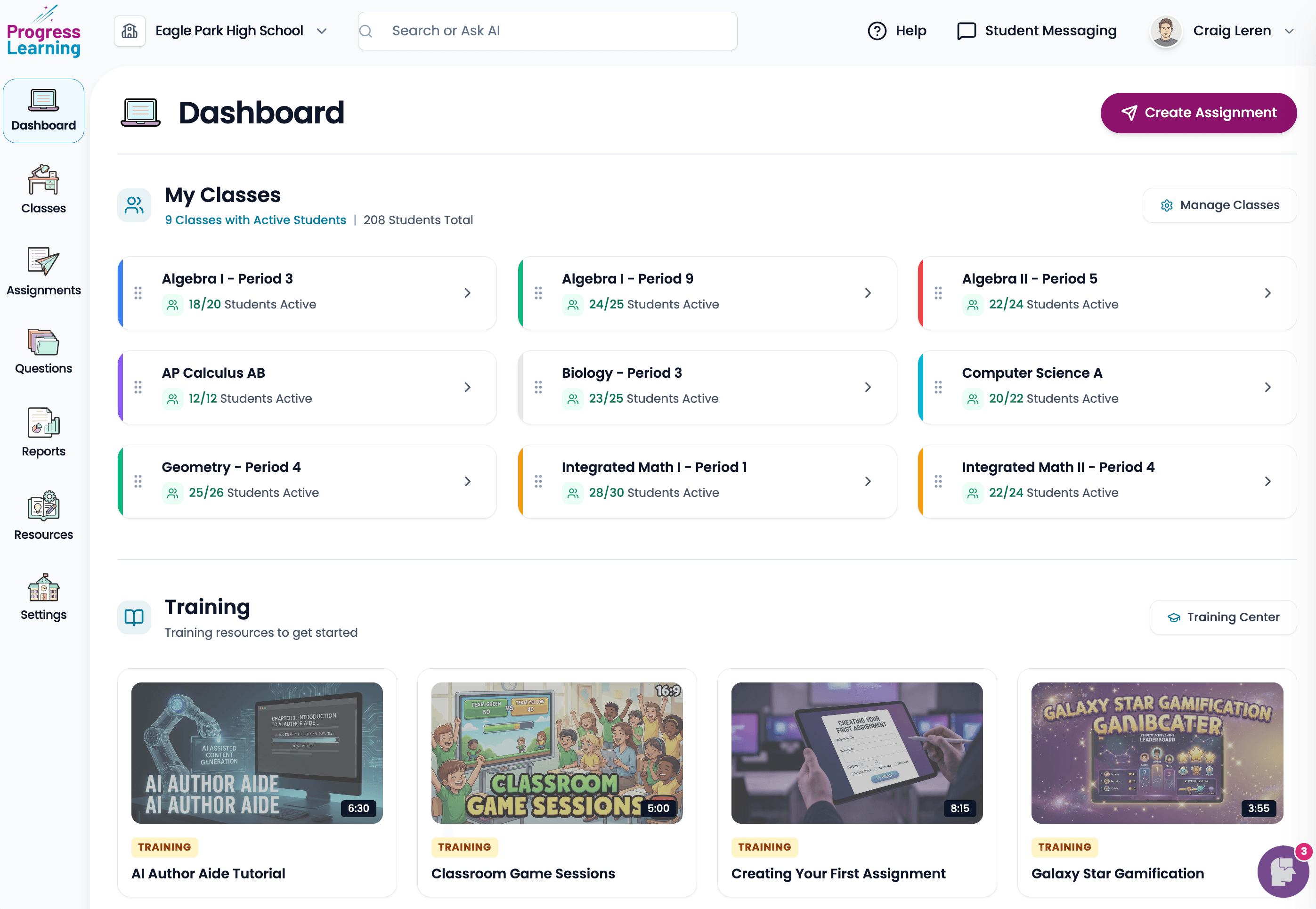
Progress Learning is a K-12 instructional platform serving millions of students and educators. I joined in 2025 after the Horizon Education migration to lead a comprehensive redesign of the platform, addressing the usability concerns that existing customers had been telling us about for years. This case study shows that redesign in progress.
The problem
Progress Learning's platform had grown organically over a long period. The result was familiar: dense screens, inconsistent patterns, navigation that made sense to people who'd been using it for years and bewildered everyone else. Usability was the number one piece of feedback in renewal conversations. Not features, not pricing. Usability.
The redesign isn't a re-skin. It's a re-architecture: a unified design system, a simplified information architecture, and a revised navigation model, informed by the lessons I learned scaling Horizon's UI through its own redesign cycles.
How I work
I design in Figma, then build full-fidelity interactive prototypes in code. I use Cursor as my primary tool, paired with Anthropic and Google models for generation, refactoring, and quick iteration on components. The point isn't to skip the design process. It's to compress the gap between a Figma file and something a real user can actually click through.
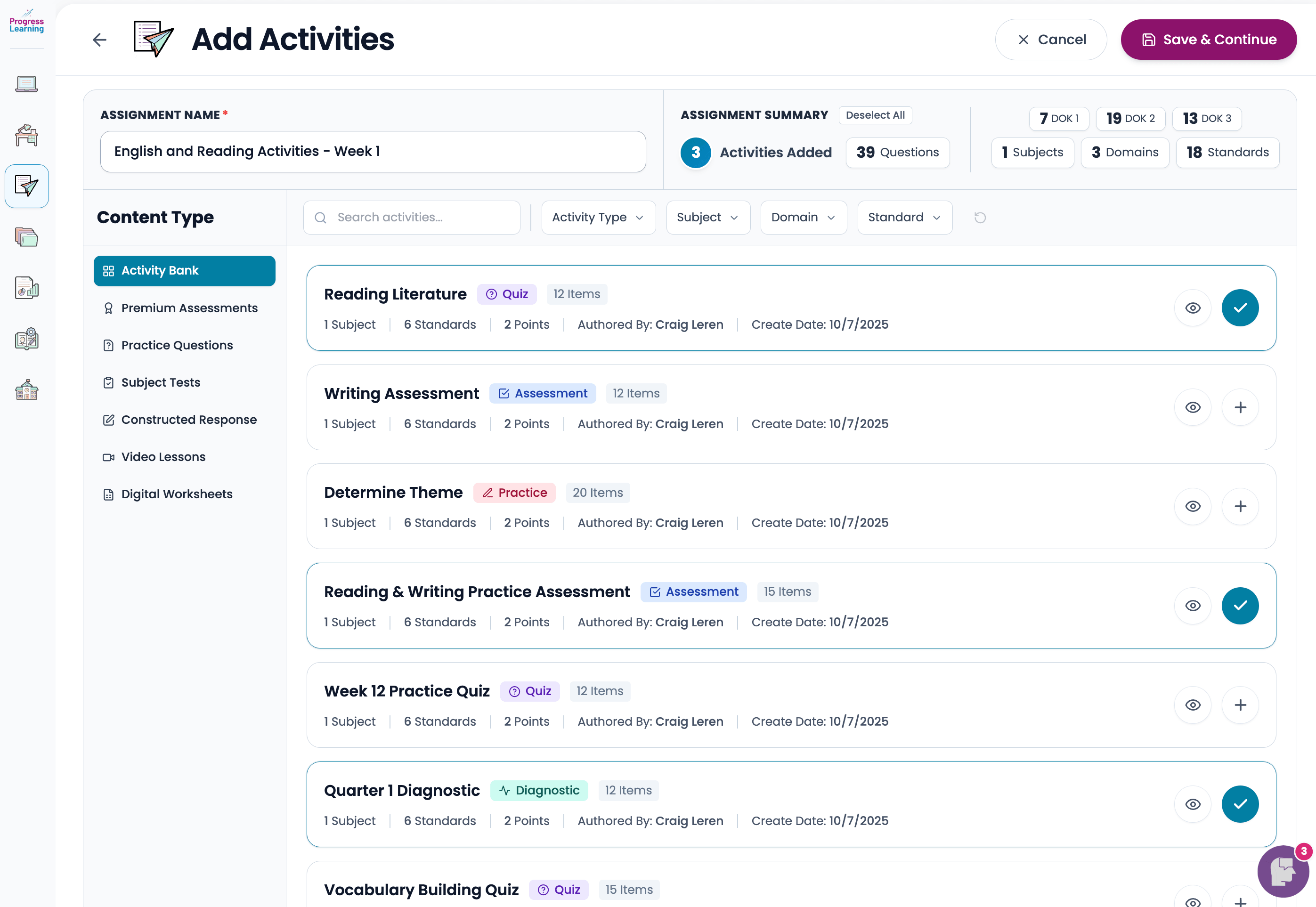
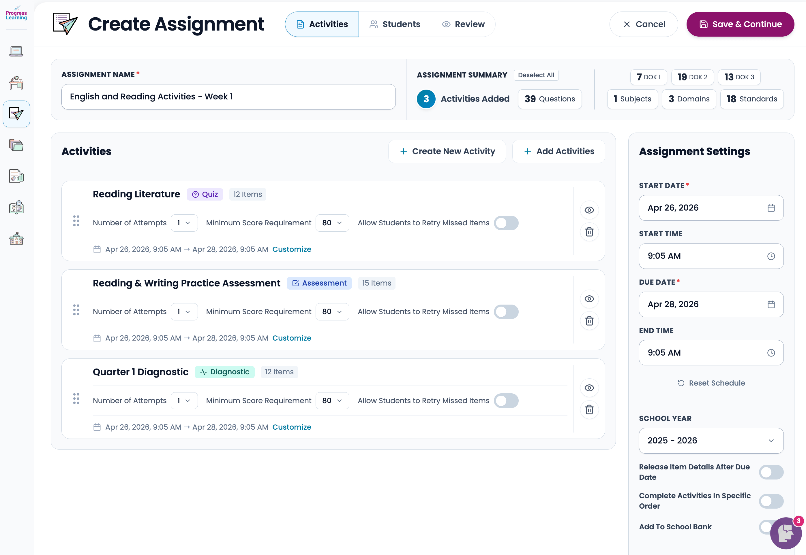
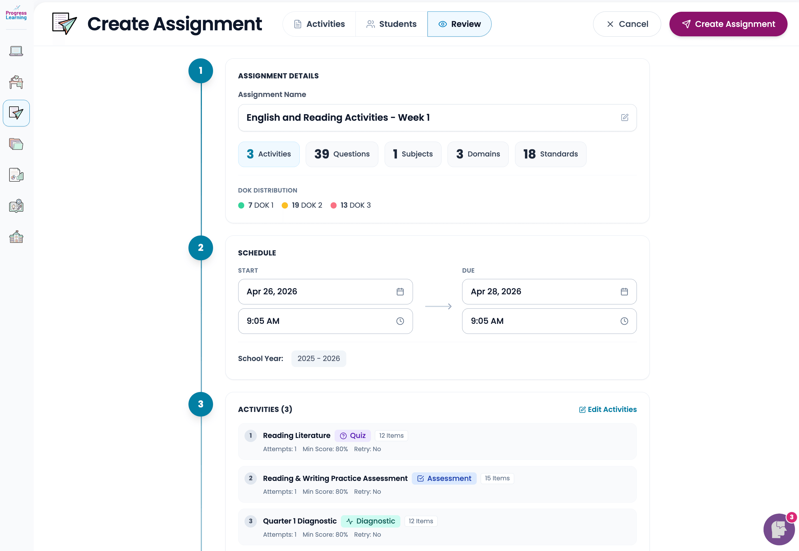
The full prototype I built for this redesign is interactive end-to-end: real navigation, real state, real responsive behavior. It's been the main vehicle for stakeholder reviews, customer validation sessions, and engineering handoff. Now I'm coding directly into the production codebase, working alongside the front-end team to ship the redesign live.
Design engineering, in practice
The reason I work this way is straightforward. The gap between "the Figma" and "what actually shipped" is where most product design work goes to die. When I own both ends of that pipeline (the design and the front-end implementation), I can make calls about component structure, responsive behavior, and interaction details as I'm designing them, instead of writing a spec and hoping it survives translation. It also means the design system I'm building in Figma and the component library shipping in production stay in sync, because they share an author.
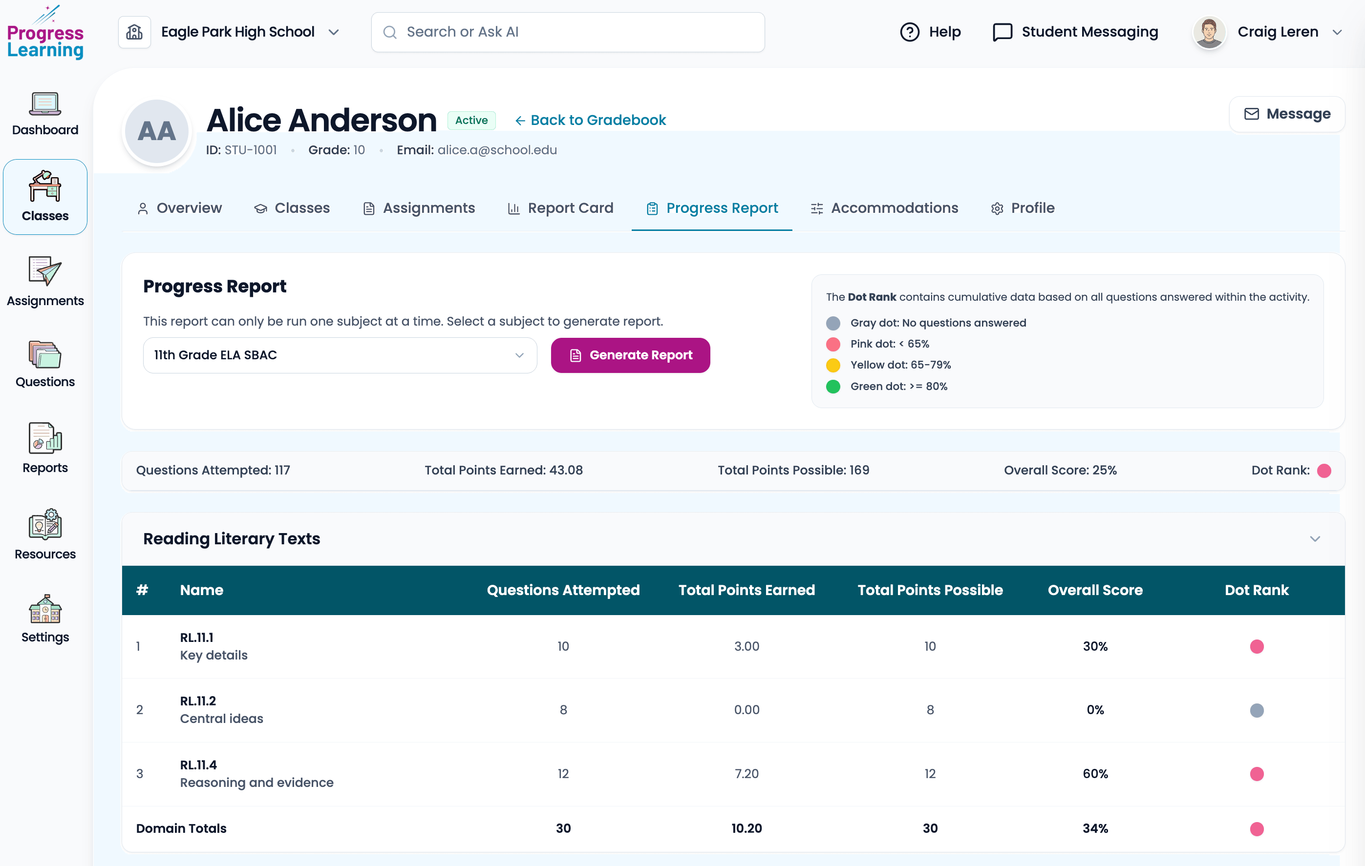
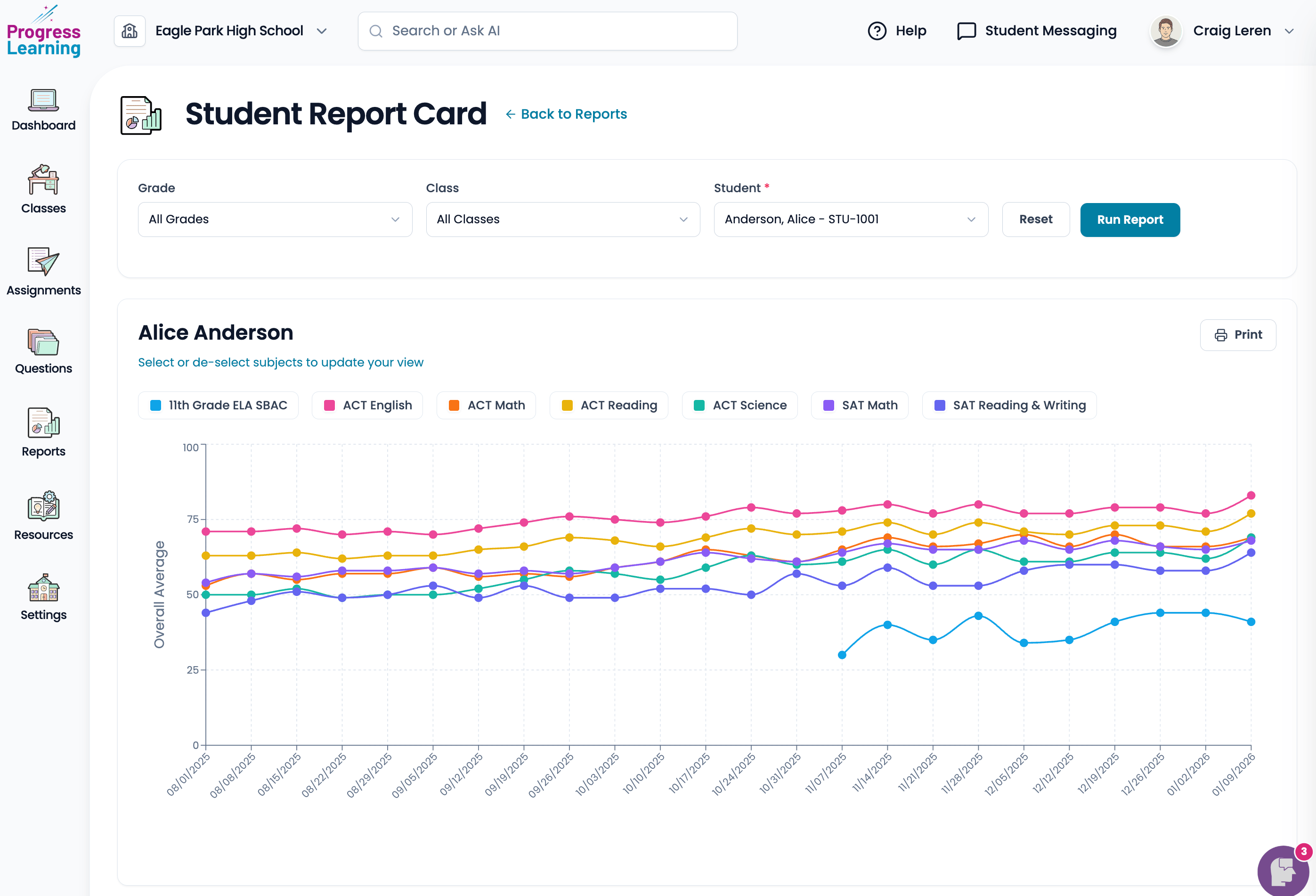
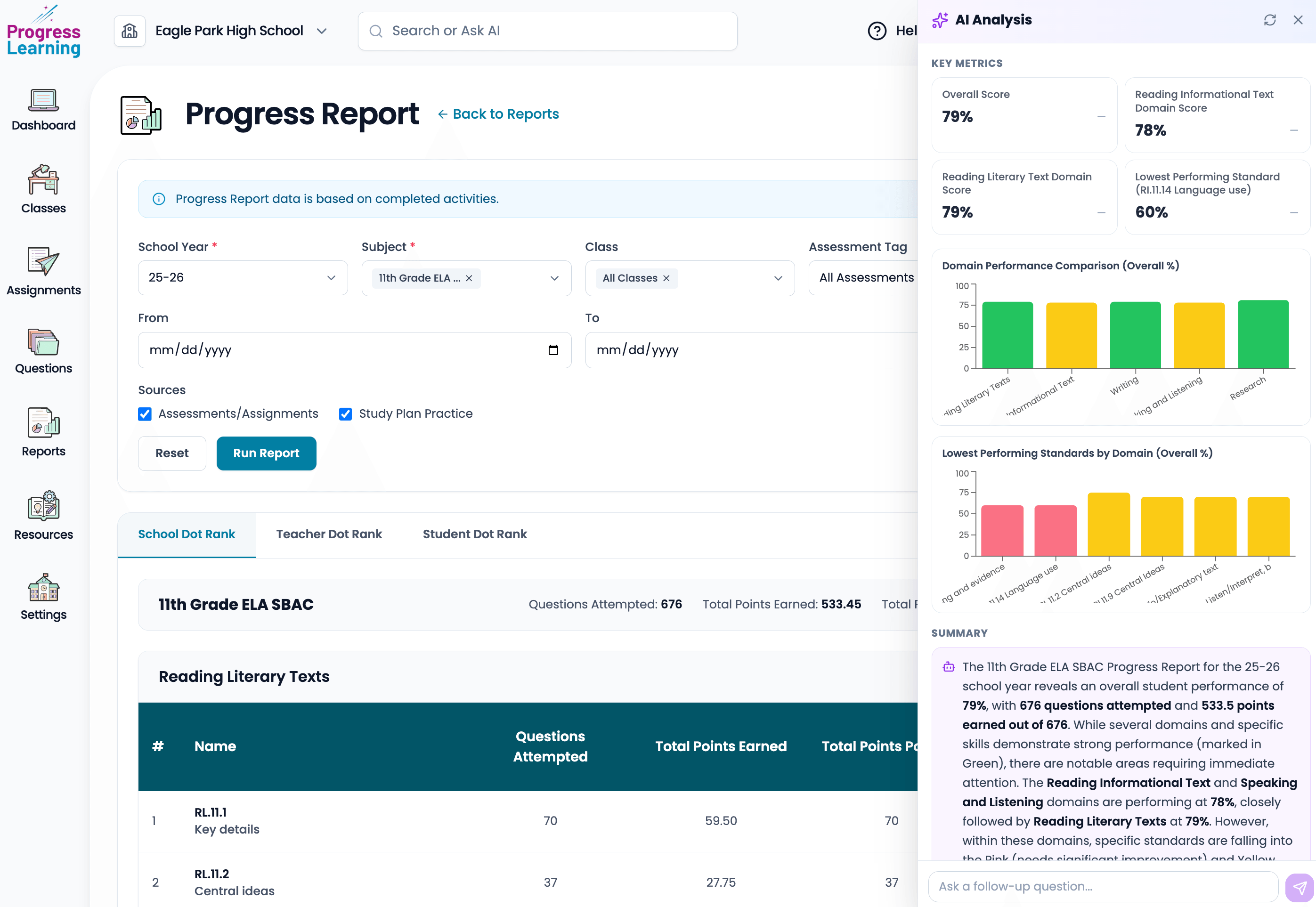
In the product, that shows up in flows like the school Progress Report (with an AI analysis panel) and the student report card in Reports, both below.
Next case study
K-12 Compare
A free, independent platform for educators to research, compare, and manage the EdTech their schools use.
Read the case study